
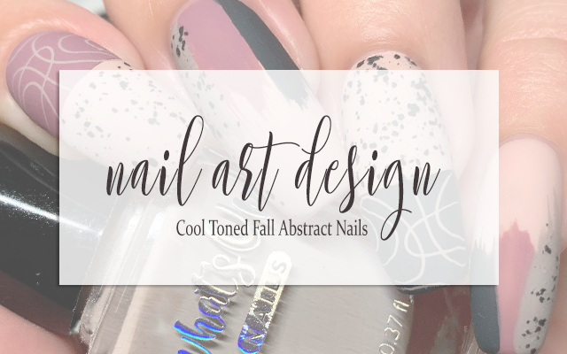
NAIL ART: Cool Toned Fall Abstract Nails
I think it can be pretty easy to get stuck in the warm toned pumpkin spice of it all come fall, but I also really love to go for ashy cool tones at this time of year as well and I think they deserve some love also...Sso, of course, I decided to grab for some gorgeous polishes that for some reason always make me think of fall and put together this simple and yet pretty intricate abstract inspired by this gorgeous mani I saw on Instagram a while back and just fell in love with.
Keep reading for more!
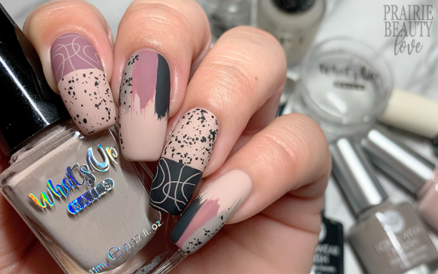
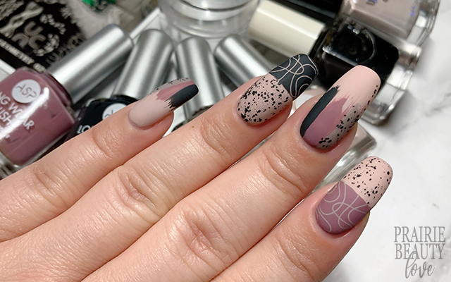
I decided to go for four shades that I thought really covered all of the bases for this mani. I started with a pale, ashy pink shade to use as the base of the mani, then a deeper ashy mauve, a sort of concrete grey, and finally a deep charcoal navy that I think really grounded the whole thing with a sort of... impactful but not stark contrast, if that makes any sense whatsoever.
To start, I applied two coats of the pale pink shade to the nails that would be getting the drybrush technique. For that nails that were going to get the color blocking technique, I applied a straight nail vinyl towards the center of the nail and then applied a fairly heavy coat of the shade that was going to color the base of my nail. Next, I removed the nail vinyl and then carefully applied the tip color directly next to the base color. It definitely takes a steady hand to do this, but it does work out pretty well if you have that crisp line to go from.

Now, for the design. For my first and ring fingers, the color blocked ones, I knew I wanted to add distinctly different designs to each block. For the pale pink block on both nails, I went in with a layer of spotted top coat to add some irregular texture and really sort of bring in that vibe of ceramics. Next, I decided to go in with some stamping for the other blocks and decided on this sort of random loopy design. I chose a pale taupe stamping polish for this step and just applied the design carefully, lining up the edge of the image at the edge of the color block. Luckily for me, that taupe shade did actually end up looking really, really similar to the pale pink once it was placed next to it and it really brought the whole thing together.
For my pinkie, middle and thumb, I did a three color dry brush. I started with the mauve color in the center and then added the navy and gray on the outsides. I did my best to try and keep the colors balanced as far as width... but I had mixed success on that front. I also added some of the spotted topper just over the gray bit of the dry brush to try to bring some more cohesiveness to the whole mani.
Once I was finally happy with the overall design (this one did take me a few tries and quite a while to get right), I sealed it in with a nail art top coat and and then followed with a matte top coat to take down the shine. And voila!
All Products Used
ASP - Wink*
ASP - Grey vs Gray*
ASP - Whisper*
ASP - Dark Storm*
Whats Up Nails - Buff Is The Stuff
Cirque Colors - Spotted
Apipila Smudge Free Top Coat
OPI Matte Top Coat
KADS Geometry 021 Stamping Plate
Whats Up Nails Magnified Clear Stamper
Whats Up Nails Wide Straight Tape Nail Vinyls
* = PR Samples

Honestly, this is one of those times when I'm kind of obsessed with how the overall mani turned out. I've wanted to recreate Sophia's design for some time now and I always sort of figured that I would end up doing it in a similar color story to the one she used, but I love this cooler toned version and I think the addition of the stamping also makes it a little more me. Love!
Be sure to head over to Cosmetic Proof and See The World In PINK for more fall themed nails for this week's #CBBxManiMonday! And, of course, if you're not already following me over on @pblnails on Instagram, be sure to heaf over there as well to check out video tutorials for all of my nail designs!
Thanks for reading!


0 comments