NAIL ART: Soft & Muted Leafy Smoosh Mani
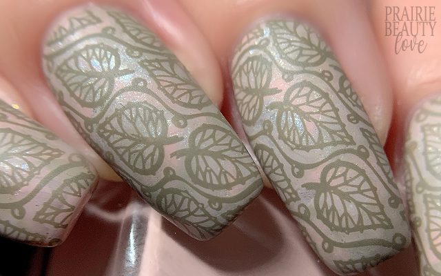
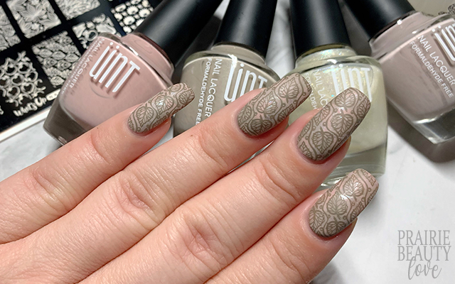
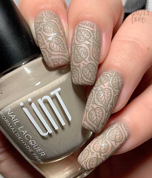
Recently I was gifted some really, really lovely polishes from Unt and I was so eager to use them, but they didn't really fit in with the Halloween vibes so I've been holding off on using them until now. Because these colors are all so soft and desaturated, I knew that I wanted to do something sort of delicate with them and maintain that muted look overall. Of course, because I'm me, that meant putting them together in what is perhaps the most subtle smoosh I've ever done - and I love how it turned out.
Keep reading for more!
So like I said, all of these polishes were very soft and I really wanted to lean into that. The fours shades that I ended up using for this mani are a warm taupe, a cool taupe, a soft ashy pink, and then a metallic shimmery almost-white that I decided to include to add a really subtle bit of texture to that smoosh base. I started by applying one coat of the warm taupe shade to all of my nails to serve as the base.
Next, for the smoosh, I applied dots of each of the four polishes I was using to my stamper. Because I wanted this smoosh to have a really soft, fluid look to it, I would say I went moderately heavy on the amount of polish I applied to the stamper and I tried to apply roughly the same amount of each color so that none of them overwhelmed the others. I also, of course, applied a latex cuticle barrier to aid in clean up and let that dry before I moved onto the actual smooshing part of the mani. Finally, smoosh time - I just pounced the stamper onto the nail a few times until I got the desired blend and then quickly went in with my clean up brush to remove some of the excess pooling at the cuticles.
Now for the stamping. I've been wanting to use this leafy image for a while now and this mani just felt like it would be the perfect fit. I actually went back and forth several times on which stamping polishj I was going to use for this mani. Initially I thought I would go with white, since it would have some pop on this really soft base without being too high contrast, but in the end I decided it would still be too stark. Ultimately, I decided to go with this slightly olive toned taupe shade that I think melds really well with the base while having enough depth that it doesn't disappear. As is my custom, I did alternate the direction of my stamping placement, though I think that ends up particularly subtle with this particular stamping image.
Finally, once I was happy with my stamping, I sealed it in with a nail art top coat and then finished with a layer of matte top coat to further soften the overall look of this mani by bringing down the shine. And voila!
All Products Used
Unt Nail Polish - LJ166*
Unt Nail Polish - LJ161*
Unt Nail Polish - LJ162*
Unt Nail Polish - LJ147*
Maniology - Down The Chimney
Maniology Smudge Free Top Coat
Anchor & Heart Sea Glass Matte Top Coat
Whats Up Nails B021 Autumn Tales Stamping Plate
Whats Up Nails Magnified Clear Stamper & Scraper
Pueen Latex Tape Liquid Peel Off Cuticle Guard
* = PR Sample
I think a lot about contrast when it comes to putting together nail art. Most of the time, my focus tends to be on creating contrast in order to pop certain parts of a design, but in this case I really tried to minimize contrast while still maintaining the integrity of the design in order to keep things soft and delicate. I have to say, I definitely think that method has its place as well.
If you want to see how I did this mani, be sure to head over to @pblnails on Instagram for a video tutorial and follow me there to keep up to date on all of my nail art designs.
Thanks for reading!


0 comments